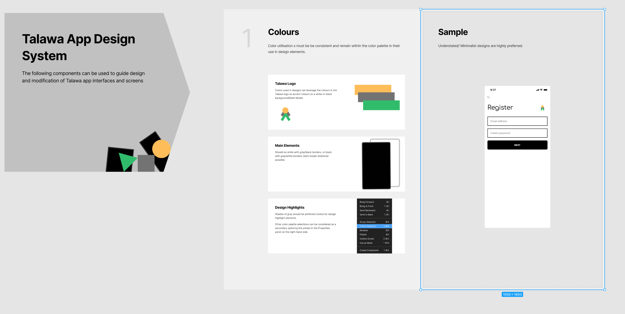
Design System
This page provides details about the design files we use or have used to create the Talawa software product line.
Talawa Mobile
The original mobile app design system can be found here
Talawa Mobile - Figma Designs
We have had many Figma designs over the years. Here are some of them.
Current
The most current Figma Design as of December 2023
Legacy
These files are of historical value to the repository
Talawa Admin
We follow a single Figma file for the designing of the Talawa admin and user portal. You can refer to the link below to suggest new designs and help maintain consistency in the look and feel for Talawa:
Talawa Admin - Figma Designs
You can find our most current Figma designs here
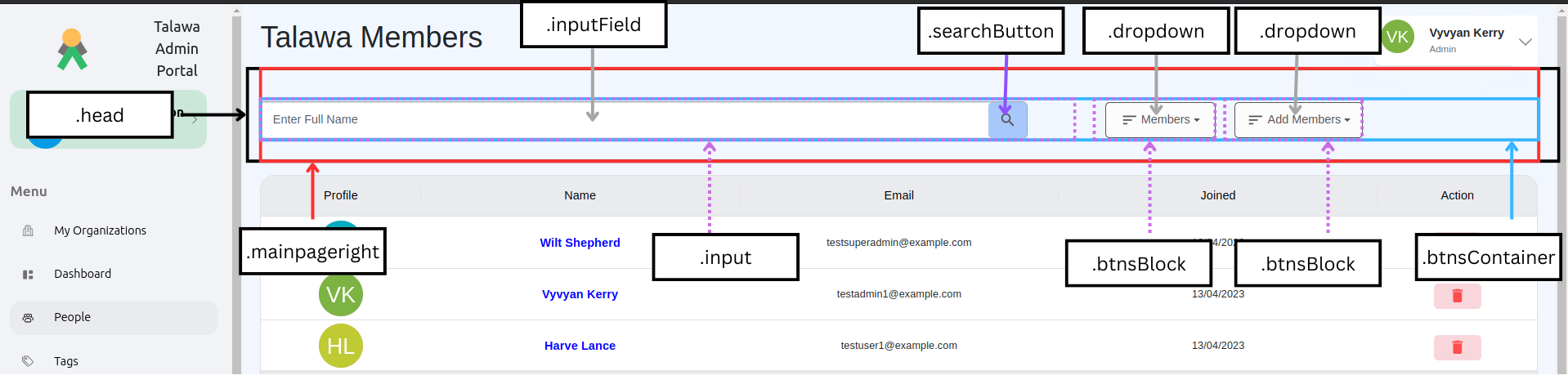
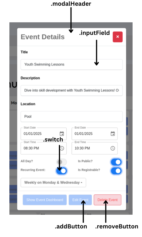
CSS Methodology
To ensure consistency across the application and reduce duplication, common styles
(such as button styles) have been moved to the global CSS file. Instead of using
component-specific classes (e.g., .greenregbtnOrganizationFundCampaign, .greenregbtnPledge), a single reusable
class (e.g., .addButton) is now applied.
Benefits:
- Reduces redundant CSS code.
- Improves maintainability by centralizing common styles.
- Ensures consistent styling across components.
Components:
This structre of styling can be followed accross all the components/screens for consistent design.
Search Bar:
- (example: src/screens/OrganizationPeople.OrganizationPeopl.tsx)
Modal:
Tabs:
- (example: src/screens/Volunteer.VolunteerManagement.tsx)
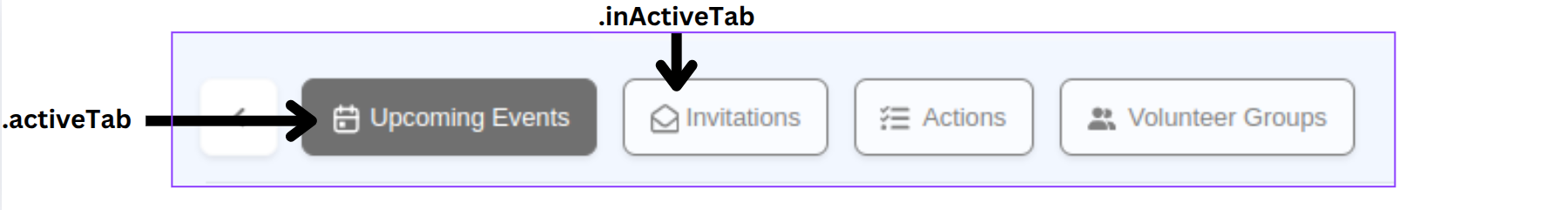
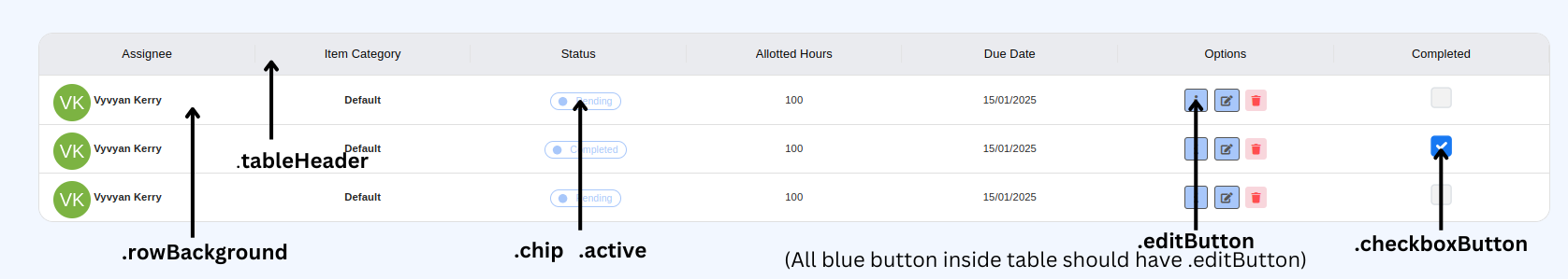
Table:
- (example: src/screens/OrganizationActionItems/OrganizationActionItems.tsx)
Other
Feel free to contribute your suggestions!